Overview
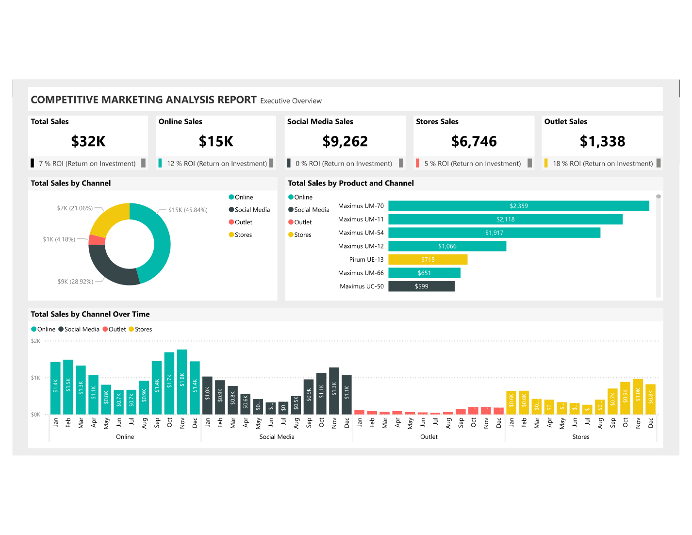
Marketing teams running campaigns across multiple channels often struggle to compare performance apples-to-apples. This dashboard was built for a US-based retail brand to answer a single core question: where is each dollar of marketing spend generating the best return — and which channel, state, and brand combination is driving it?
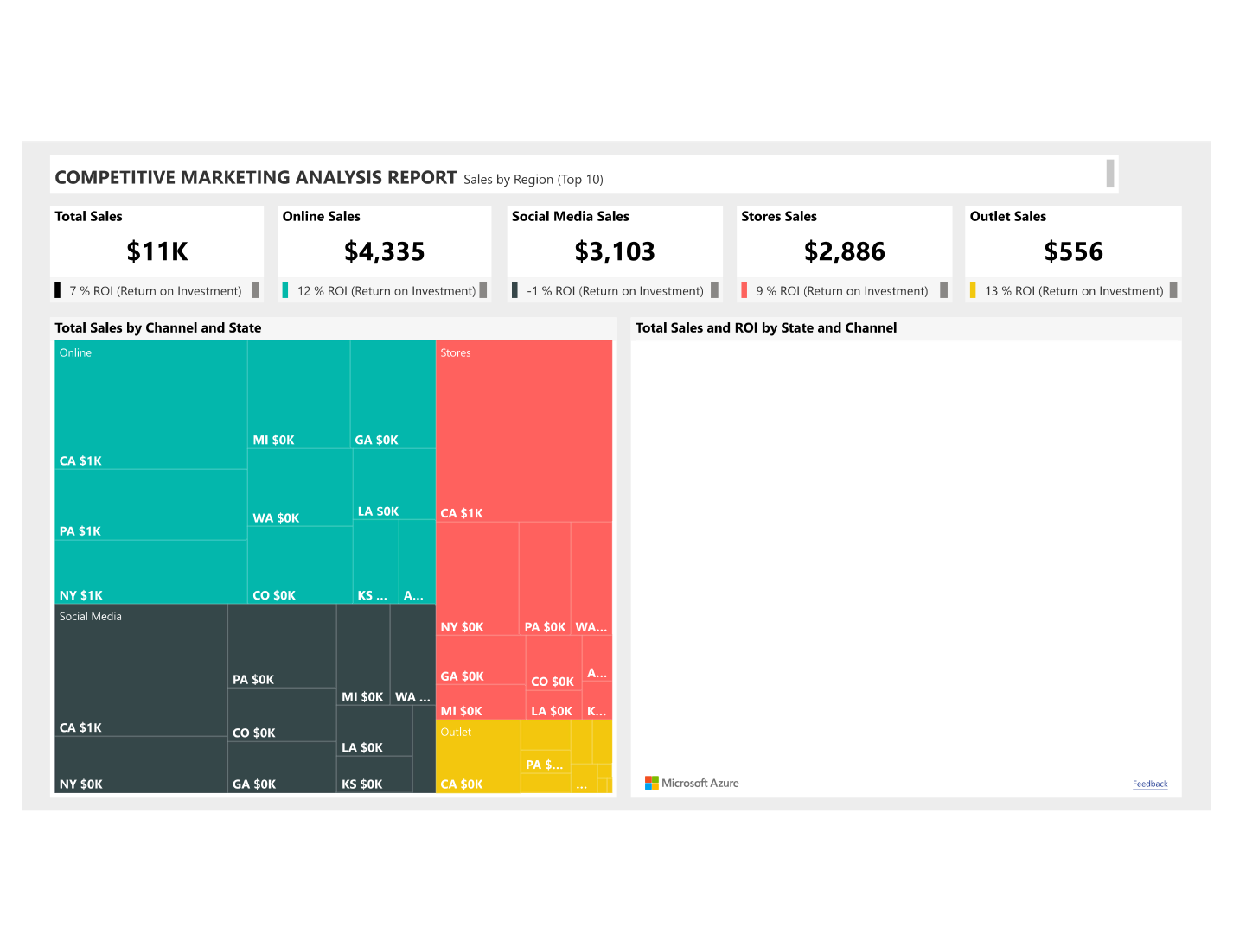
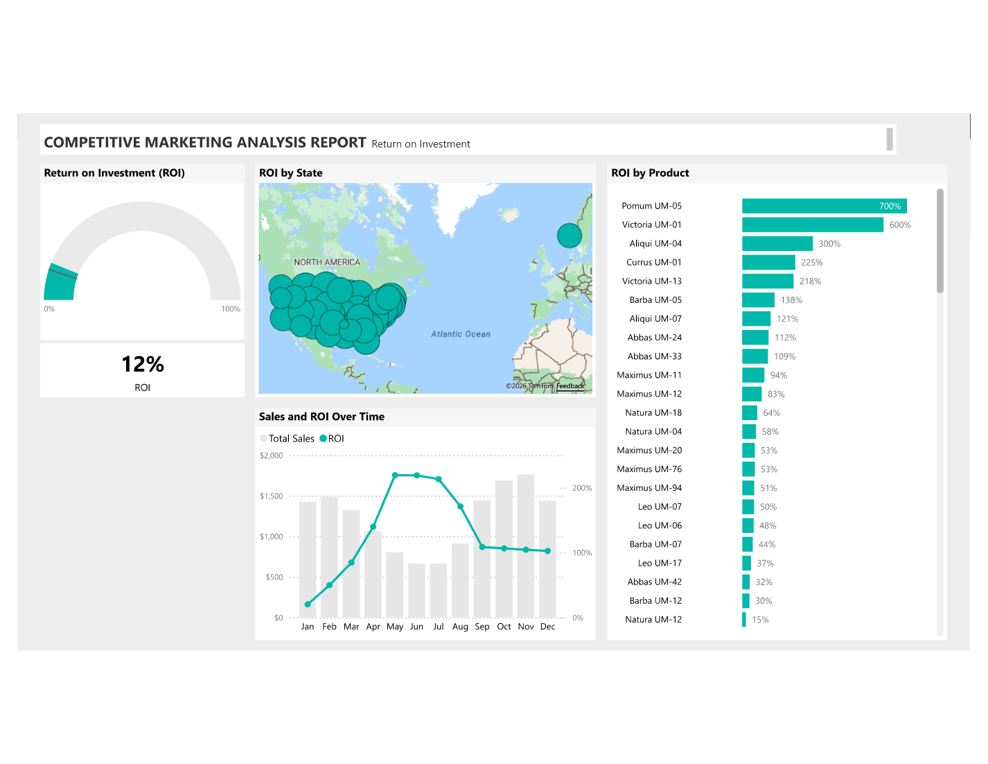
The report covers four distinct sales channels (Online, Social Media, Physical Stores, and Outlet) across multiple US states and three product brands. Across three pages, the dashboard moves from a strategic overview down to granular channel and brand-level drill-throughs that enable marketing managers to reallocate budget with confidence.
Data Sources & ETL
- 📥 Source data: Marketing spend and revenue files per channel exported from the client's campaign management platform — consolidated into a single flat table in Power Query
- 🔄 Channel consolidation: Mapped 12+ raw channel variants to 4 standard channel categories (Online, Social, Stores, Outlet) using a lookup reference table
- 🏷️ Brand tagging: Product SKUs mapped to three brand identities (Maximus, Pirum, Victoria) via a brand dimension table joined in Power Query
- 🗺️ State mapping: US state abbreviations expanded to full names and linked to Power BI's built-in US map geography for filled-map rendering
- 📅 Date table: Custom calendar table with fiscal period, week number, and rolling period calculations to support YTD and prior-period DAX measures
- ✅ Data quality: Removed duplicate campaign entries, filled missing spend values with zero, and validated that revenue totals reconciled with source reports
Key Visuals & Features
- 📊 Page 1 — Marketing Overview: Total spend, total revenue, blended ROI, and customer acquisition cost KPI cards; clustered bar comparing revenue vs spend by channel; US filled map coloured by ROI; trend line showing spend efficiency over time
- 📡 Page 2 — Channel Deep-Dive: Side-by-side channel scorecards with ROI, conversion rate, and revenue metrics; scatter plot positioning each channel on a spend vs return quadrant; channel-to-channel performance ranking table
- 🏷️ Page 3 — Brand Comparison: Brand-level revenue contribution stacked bar; radar chart comparing Maximus / Pirum / Victoria across 5 KPIs; brand-by-channel revenue matrix heatmap
- 🔁 Interactivity: State map cross-filters all other visuals; channel slicer synced across pages; brand selector panel with bookmark-based show/hide
- 📌 Dynamic ROI indicator: Conditional formatting highlights channels where ROI falls below a user-defined threshold, turning cards red automatically
DAX Highlights
- → Marketing ROI = DIVIDE([Total Revenue] - [Total Spend], [Total Spend]) — formatted as percentage with positive/negative colour coding
- → Revenue per $ Spent = DIVIDE([Total Revenue], [Total Spend]) — used in scatter plot and channel scorecards
- → Channel Rank by ROI = RANKX(ALL(Channel[Channel Name]), [Marketing ROI]) for the dynamic ranking table
- → State vs National Average = [State ROI] - CALCULATE([Marketing ROI], ALL(Geography[State])) — surfaces above/below-average states in the map tooltip
Results & Impact
4Sales channels benchmarked in one view
3Brand performance profiles compared side-by-side
State-levelGeographic ROI breakdown across the US